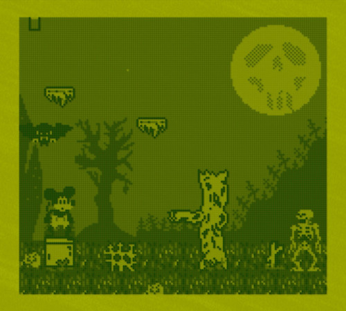
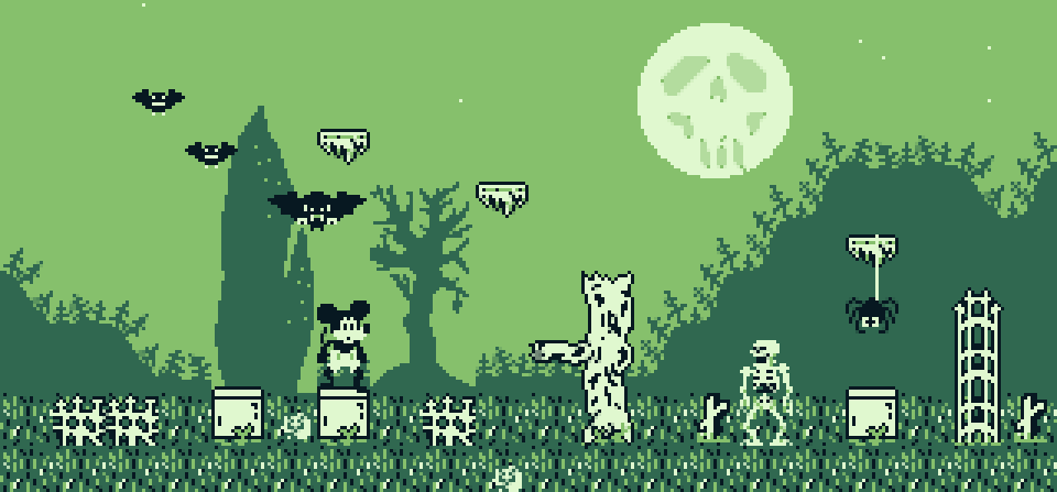
new look for Mickey the Mouse in Cryptsmasher 😲

here's the new look I've been cooking up for Mickey the Mouse: Cryptsmasher. what do you think? (see previous posts for compare)

the goal was to make it more visible on the DMG screen while also making it look more like the old cartoons but with a Game Boy twist. you'll notice the foreground elements all pop while the backgrounds stay simple and darker to try and approximate the same effect as the hand painted backgrounds of the source. i really want to respect that source and do it justice.
additionally (hey thanks if you're still reading!) I wanted to work with bigger sprites so I could challenge myself with the increased animation that would en-"tail". I am attempting to 'git gud' as the kids are wont to say.
i want to get a gameplay demo out soon but for now I'm working hard on the animations :)
thanks for looking!
Adam🍟
Mickey the Mouse: Cryptsmasher
IN DEVELOPMENT
| Status | In development |
| Author | Holmade Games |
| Genre | Platformer |
| Tags | 8-Bit, Game Boy, Game Boy ROM, mickey, mickeymouse, mouse, Pixel Art, Retro, rom |
More posts
- To Tell a Tale 👻🐭45 days ago
- Mickey Mouse Palette Swapping!50 days ago
- Skeleton Walk Cycle 💀51 days ago
- Updated Cryptsmasher Footage!52 days ago
- Some Cryptsmasher Footage! 🐭👻Dec 17, 2024
- Behind the Scenes of MtM: Cryptsmasher we go!Oct 13, 2024
- New Over-Sized Sprites. Should I....?Jul 02, 2024
- Concept Art #1Apr 11, 2024

Comments
Log in with itch.io to leave a comment.
Looks good!
Thank you!! 🙏🏻 It's evolved since this too, I'm just getting the first area ready to really demonstrate it ☺️